Have you experienced entering a room and feeling calm, not knowing how or why? Or entering another space and feeling some weird restlessness? Probably, color was a big part of it! When it comes to color choices for rooms, it is no simple decision to make, and it is not only about going with your sofa or the latest trend. There are moments where it’s about comprehending how color effectively does influence the manner we feel, think, and perhaps even rest in our very own homes.
We’ve painted hundreds of homes in Perth at City Painters WA, and we’ve found out that when it comes to color, one thing we know is that the right color can make a House, a home, and the wrong one can work against you day in, day out.
The bedroom that refused to rest
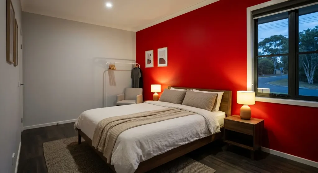
We took a call recently from a client, whom we’ll call Emma, who was in a super frustrated state as she’d recently gone through a phase of painting herself a new bedroom in a bright, vibrant shade of red, after looking at a photo online. It really had a nice picture in it. However, she soon found that getting to sleep was becoming difficult; she was somewhat tense during the evenings and just not feeling relaxed in her room anymore.
At a consultation conducted by our team, it was clear within minutes of the appointment what was going on. Red is a stimulating color. It can increase energy, heart rate, and alertness, and is one of the best options for a gym room or a dining room, but not a bedroom for sleeping. Emma had no fault in her painting technique. The error that she made was actually due to the wrong choice of color in opposition to the purpose of the room.
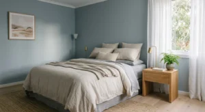
Instead, we were able to work with her to repaint the area in a soft, muted blue-grey color. In just a few days, we could see the results! The house suddenly came to feel more like a warm place to relax than a room that kept her up. But it’s the true strength of paint color significance. Not something just for decoration anymore; it’s psychology on your walls.
Designing with color is an art because of its beautiful nature, and the use of color psychology is paramount for any design project.
Color has an impact on us that we don’t really notice. Research on environmental psychology has revealed that color has diverse effects on mood, stress, and appetite, along with attention and sleep quality. That’s why it’s crucial not to make a color choice just for the sake of it in any room.
What color can really do in a house:
- Warm colors such as red, orange, and yellow help to invigorate a room and stimulate dialogue.
- Cool colors such as blues, greens, and light grey are generally relaxing; they calm the nervous system.
- Neutral colors balance with each other and can give the impression of more space in a room.
- Emphasis may be added to ideas and personality through intelligent use of bold accent colors.
The key is to know what it is, so you can know how to choose and then never look back 3 weeks after the paint is dry.
The Best Colors for Bedroom Spaces: Suggestions and some energy analysis
The bedroom is the place where we rejuvenate, so it’s the room that really needs the most careful attention in the house when it comes to colors. Some of the best coloured bedroom spaces include colors from the following palettes according to color psychology; we have seen these spaces look beautiful in real WA residences:
- Carmellite: Soft and quite gray with a blue tone, calming, sleep-friendly
- Neutral beige with a glamorous yet cozy texture, ideal for a relaxing vibe
- Sage green, a muted color similar to balance and tranquillity
- Blush pink (suggest calming and not too flashy)
Reducing the visual stimulation in a bedroom is the goal in nearly every case, as this helps your mind properly turn off when it gets dark.
Every Room Calming Paint Colors
There are many rooms throughout the house that exude a peaceful and quiet ambiance, and of course the bedrooms are a prime example of rooms that benefit from such tones; however, there are many other rooms as well, such as the home office area, reading spot, and even bathrooms. Many types of calming paint colors have a few common characteristics: they’re desaturated, cool-leaning, and have little contrast with the furnishings in the room.
In Perth homes, some of our most requested calming shades are soft sage, dusty blue, warm greige, and pale lavender. These tones are especially effective in areas where individuals are seeking tranquility, maintaining concentration in a quiet environment, or simply relaxing and enjoying a respite from the hustle and bustle of everyday life for a moment.
What Does Each Paint Color Say?: What Each Shade Really Says
Knowing the meaning of paint color can eliminate a lot of the trial and error associated with decorating. Color theory, though not an exact science, provides a useful guideline that can be used:
- Bedrooms and bathrooms are the ideal uses for blue, for it signifies calm, trust, and stability.
- When it comes to green and renewal, Green connects perfectly in living rooms and studies.
- Yellow is a warm, optimistic shade, so be sure to add some spice to the room, or it can become overpowering.
- Grey is elegant and understated, but there’s a lot to consider when aiming for it.
- White provides openness and simplicity, but without an appropriate warm touch, it could be cool.
If you know what the colors have to say and have purposeful intent around using them, you will choose colors with intent, not guesswork, particularly in spaces where mood is important.
These are some ideas to think about when choosing your room color.
Just like each room of the house has a different role to play, there is no one color that fits all the rooms. A warm neutral or soft green color is a popular choice for the living room, as it creates a comfortable atmosphere and encourages conversation. Whites or neutral shades are often better choices for kitchens, as they can create a sense of cleanliness and a welcoming atmosphere. So that you can possibly focus long enough to finish your work, soft blues or greens in the home office are ideal; and for bathrooms, a spa-like color is always a good choice, as it raises a sense of tidiness and tranquility.
Here are a few practical tips about room color that we love to give our WA clients:
- The corners of living rooms should be painted warm greige, soft terracotta, and muted olive colors.
- Living rooms: taupe, white, or warm cream
- Home offices: dusty blue, sage green, or light charcoal color accents
- Toilets: soft aqua or light grey (or clean white) toilets
Our Professional Recommendation
As we see our clients from Perth, our advice is the same following years of color consultations and repaints. Before you consider the design of a room, consider how you would like to feel in it. Though something may look gorgeous in a photo, when it is not serving the room’s intended function, you will be feeling it each and every day like Emma did.
Here are a few tips we always gave our students:
- Test colors on your actual walls before buying colors under both natural and man-made lights.
- Think about how the space is being used and plan backward from the color.
- Don’t just go with color trends and something you see on Instagram because it doesn’t mean that you need that color.
- Muted and toned colors are almost always better to choose, as schemes are chosen carefully, and when in doubt, muted and softened are better options than bold and saturated.
If you’re still dizzy and confused about all of your choices, you’re not alone. Color psychology is indeed a craft and is used in each and every project our crew works on.
FAQs: Choosing Paint Colors for Rooms
Q: What is the best color for a bedroom to help with sleep?
A: Soft, cool tones like blue-grey, muted sage, or warm neutral beige are generally considered the best colors for bedroom spaces, as they help calm the mind rather than stimulate it.
Q: What are the most calming paint colors for a home?
A: Desaturated, cool-leaning shades such as soft sage, dusty blue and pale lavender are widely regarded as the most calming paint colors across bedrooms, bathrooms and reading spaces.
Q: Does paint color really affect mood?
A: Yes. Environmental psychology research consistently shows that color can influence stress levels, focus, sleep quality, and overall mood, making paint color an important factor in home design.
Q: How do I choose room color ideas that suit my whole house?
A: Start by considering each room’s function, then choose colors that support that purpose rather than clash with it. Testing swatches under your home’s actual lighting is essential before committing.
Q: Should every room in the house match the same color scheme?
A: Not necessarily. While a cohesive flow between rooms feels harmonious, each space can have its own tone as long as transitions between rooms feel intentional rather than jarring.
_______________________________________________
Choosing paint colors for rooms is one of the most personal decisions you’ll make in your home, and getting it right can genuinely change how you feel every single day. If you’d like expert guidance on color psychology, calming paint colors, or a full home color consultation, get in touch with City Painters WA today and let our experienced team help you create a space that truly feels right.