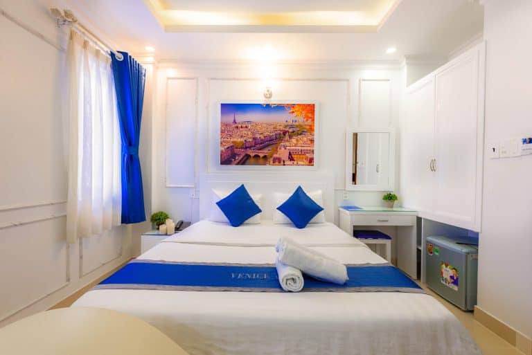
Choosing the right bedroom paint colour is the single biggest decision in the room it shapes how restful the space feels, how large it looks, and how well it works with your furniture and light. The best bedroom colours are soft, warm and muted: warm whites, gentle sage greens, dusty blues, earthy neutrals and, for a cosy retreat, deep moody tones like charcoal, aubergine or navy. Below you’ll find 25+ tried-and-tested bedroom paint colours, how to match them to your room’s size and light, and the shades trending in Australian homes in 2026.
We’ve painted hundreds of Perth bedrooms, so this guide is written from what actually holds up on the wall not just what looks good on a screen.
How to choose the right bedroom paint colour
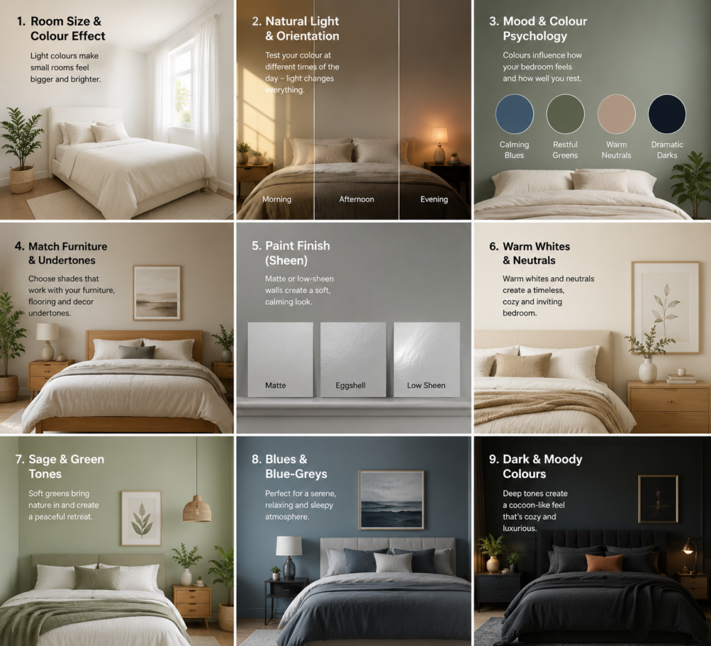
Before you fall in love with a shade, run it through these five checks. Most “wrong colour” regrets come from skipping them.
1. Room size
Light, cool and neutral colours make a small bedroom feel larger and airier, because they reflect more light. Darker, warmer colours pull the walls in and create intimacy perfect for a large master bedroom, but risky in a compact room unless that cocooning effect is exactly what you want.
2. Natural light and room orientation
In Australia, orientation matters more than most people realise:
- North-facing bedrooms get warm, generous light all day and can carry cooler colours (blues, greys, greens) beautifully without feeling cold.
- South-facing bedrooms receive cooler, indirect light. Lean into warm whites, creams and earthy tones to stop the room feeling flat or grey.
- East-facing rooms glow in the morning; west-facing rooms warm up in the afternoon. Always test your shade on the wall and look at it at the time of day you use the room most.
3. The mood you want (colour psychology)
Colour directly affects how a room feels:
- Blues and greens : calming, restful, linked to nature. Ideal for better sleep.
- Warm neutrals and blush : cosy, comforting, inviting.
- Charcoal, navy and aubergine : dramatic, intimate, cocoon-like.
- Bright reds and oranges: energising, best kept to small accents rather than full walls in a bedroom.
4. Existing furniture and undertones
Match your walls to what’s already in the room bed frame, flooring, curtains and timber tones. Every colour has an undertone (a hint of pink, yellow, green or blue underneath). A grey with a warm stone undertone works with timber and linen; a cool blue-grey can clash with warm floors. This is where most DIY colour choices go wrong.
5. Paint finish (sheen)
For bedroom walls, a matte or low-sheen finish is usually best it hides minor wall imperfections and gives a soft, calming look. Use a slightly more durable low-sheen or eggshell in kids’ rooms where walls get touched and cleaned more often. Save higher gloss for trims and doors, not walls.
The best bedroom paint colours by mood
Warm whites and soft neutrals (the safest choice)
White never dates, but the trick is choosing a warm white rather than a stark, clinical one. Warm whites carry subtle undertones of cream, peach or pink that make a bedroom feel cosy instead of cold especially useful in rooms with less natural light.
Popular Australian bedroom whites include Dulux Natural White, Dulux Whisper White and Dulux Lexicon (Lexicon in a quarter strength is one of the most-used whites in Aussie homes). A warm neutral base is also the smartest long-term choice, because you can refresh the whole look just by swapping cushions, throws and art.
Soft sage and eucalyptus greens
Green is the colour of nature, and muted greens are one of the most restful choices for a bedroom. Soft sage, washed eucalyptus and gentle olive tones lower visual “noise” and help the room feel like a retreat. They pair beautifully with timber, linen and rattan for a relaxed, organic look and they’re a standout in Dulux’s calming 2026 palettes.
Dusty blues and blue-greys
Blue is consistently rated one of the best colours for sleep. Softer, dustier blues and blue-greys feel serene without going cold. A pale blue keeps a small bedroom light and open; a deeper, smoky blue on a feature wall adds depth behind the bed.
Warm greys done right
Cool, flat greys have had their day. The greys working now are warm, stone-like greys with a hint of taupe or beige underneath think shades in the family of Dulux Reckless Grey, or the popular Dulux Domino and Monument tones. These read as sophisticated and calm rather than dull. (If you’re weighing two greys, our guide on Dulux Domino vs Monument breaks down the difference.)
Earthy tones — terracotta, clay and taupe
Grounded, earthy colours are having a real moment. Muted terracotta, soft clay, and warm taupe bring warmth and personality while still feeling restful. They work especially well with natural materials and are a lovely middle ground for anyone who finds plain white too stark but isn’t ready for a dark room.
Blush and muted “grown-up” pastels
The baby pinks and blues of the past are out; muted, sophisticated pastels are in. A dusty blush, soft mauve or gentle lavender adds a light, spacious, cheerful feel without looking childish a great alternative to all-white walls in a guest room or a light-filled master.
Teal — for a rich, sumptuous feel
Teal is a bold but surprisingly liveable base colour. Painting built-in wardrobes or a feature wall in a deep teal makes the room feel layered and luxurious, and a contrasting headboard becomes a real style statement.
Moody, dramatic colours for a cocoon effect
If you want your bedroom to feel like a private sanctuary, go dark. Charcoal grey, deep navy, aubergine and dark teal wrap a room in warmth and drama. This “cocoon” look is especially effective in bedrooms you mainly use at night. For maximum impact, some homeowners now use colour drenching painting walls, skirting, cornices and even the ceiling in the same deep shade so the edges of the room blur and the space feels seamless and enveloping.
Best bedroom colours by room type
Master bedroom: You have the most freedom here. Warm neutrals for calm, or a deep navy/charcoal feature wall for a hotel-suite feel.
Small bedroom: Light warm whites, pale blue-greys and soft sage keep it feeling open and airy.
Kids’ bedroom: Muted pastels and soft greens in a durable low-sheen finish cheerful, but easy to keep clean.
Guest bedroom: Warm neutrals or a gentle blush create a welcoming, restful space that suits any guest.
Low-light / south-facing bedroom: Warm whites, creams and earthy tones stop the room feeling cold and grey.
2026 bedroom colour trends in Australia
Australian homes are moving away from cool greys and stark whites toward warm, layered and expressive tones. The Dulux Colour Forecast for 2026 is built around calm and connection, with three palettes worth knowing:
- Ethereal: soft greens, gentle mauves, blush and creamy pastels. Dulux specifically highlights this palette for bedrooms, nurseries and reading nooks where you want to switch off. It’s the standout for a restful room.
- Elemental: grounded, earthy neutrals and warm foundations.
- Evoke: bolder, dramatic shades for those who want more personality.
Other clear 2026 directions: warm neutrals over cool greys, earthy terracotta and rust, sage and olive greens, richer burgundy and wine tones for a moody feature wall, and colour drenching for a seamless, cocooning finish.
Bedroom colours to avoid
- Bright, energising colours on all four walls: strong reds and oranges can feel stimulating rather than restful. Use them as small accents only.
- Very dark colours in a small, low-light room: unless you’re deliberately going for a cocoon effect, they can make a compact room feel cramped.
- Cool, flat greys with blue undertones in a south-facing room they can read cold and lifeless.
- High-gloss finishes on walls: they highlight every imperfection and reflect too much light for a calm space.
Get your bedroom colour right the first time
The two most expensive mistakes with bedroom paint are choosing the wrong undertone and applying it over poor surface prep. A colour that looks perfect on a swatch can look completely different once it’s on the wall in your room’s light which is why we include a colour consultation with every quote.
If you’d like expert help picking a shade and a flawless, long-lasting finish, our team offers professional interior painting in Perth and residential painting services backed by a 5-year workmanship warranty. You can also book a dedicated colour consultation in Perth or see typical house painting costs in Perth before you start.
Ready to transform your bedroom? Get a free quote today .
Frequently asked questions
What is the best colour to paint a bedroom?
The best bedroom colours are soft, warm and muted warm whites, sage greens, dusty blues and earthy neutrals for a calm, restful feel, or deep tones like navy and charcoal for a cosy, cocoon-like retreat. The right choice depends on your room’s size, natural light and the mood you want.
What colour makes a bedroom look bigger?
Light, warm whites and soft neutral tones make a bedroom look bigger because they reflect more natural light and keep the walls feeling open and airy. Pale sage and soft blue-grey also work well in small bedrooms.
What are the best bedroom colours for sleep?
Blues and greens are widely considered the best colours for sleep because they feel calming and are associated with nature. Soft, muted versions of these shades along with warm neutrals help create a relaxing environment.
What paint finish is best for a bedroom?
A matte or low-sheen finish is usually best for bedroom walls, as it hides minor imperfections and gives a soft, calming look. Use a more durable low-sheen or eggshell finish in kids’ rooms where walls need regular cleaning.
What bedroom colours are trending in 2026?
In 2026, Australian bedrooms are trending towards warm neutrals, soft sage and eucalyptus greens, dusty blues, earthy terracotta tones, and muted “grown-up” pastels like blush and mauve. Dulux’s Ethereal palette is a popular choice for restful bedrooms.